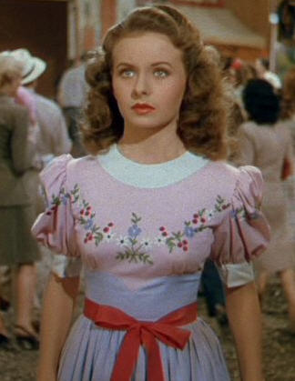
The Panatone Color Institute dished out the 2016 color(s) . . . pale pink and baby blue or what they term "Rose Quartz" and "Serenity."
"Designing with vintage elements" alarms went off!
. . . Are "vintage" designers, magazine stylists and trendsetters finally stepping away from the "gray matter?"
. . . Will we see a resurgence in demand for USA pottery?
. . . Will my collection of 1940s pottery flamingos soon find a new, younger audience who appreciates them as much as I do?
. . . Does this explain why last month --November 2015 -- all of my excess 1940s Fire King delphite dishes grew wings and flew out of Bottorff's Ruffles and Rust Square . . . AND . . . two of the most amazing "pink" store display hat stands from the 1940s lasted about a week at the Roxy . . . AND . . . two 1940s pink upholstered chairs found new homes?
Yes to all of the above. A simple Google search for "2016 design colors" supports the Ouija Board. Pale pinks and baby blues show up in every image!
So what does that mean for all of us that never stopped loving pale pink and blue vintage elements even when . . .
. . . Our customer base went "uh, NO!"
. . . The magazine stylists were threatened with termination for suggesting anything other than "gray." Gray for the walls. Gray for the furniture. Gray for the accessories.
. . . Trendsetters told us we would feel a certain "calm" draped in a monotone palette?
Not much . . .
. . . We just carry on loving the same old things we always did!
. . . We keep visiting and supporting the antique stores and antique show vendors that never wavered on their buying criteria of . . . "MUST BE OLD" . . . and who believed that many of the design elements of the 1960s and 1970s went away for good reasons!
. . . And then we plug in the original "State Fair" to hear Jeanne Crain say "ohh . . . but the house you live in!"


